
context: freelance client work
logo design; branding; art direction; Adobe Illustrator
Role
Designer
Year
2024
In the early stages of starting his mobile welding company, this client reached out requesting a logo and brand identity.
During our discovery call, I learned that his business would place emphasis on reliability and professionalism. The logo I designed would reflect the strength and spirit of the client and his story, while maintaining a polished and professional tone.
I chose a heavy-weighted serif typeface for ‘Liberty’ to define the strength of the client and his service. The serif, in combination with the dark blue colour, also conveys a sense of professionalism. Extending the leg of the ‘L’ into a welding rod makes the business’s services immediately identifiable while the yellow welding sparks add an eye-catching pop of colour.

Liberty Welding logo
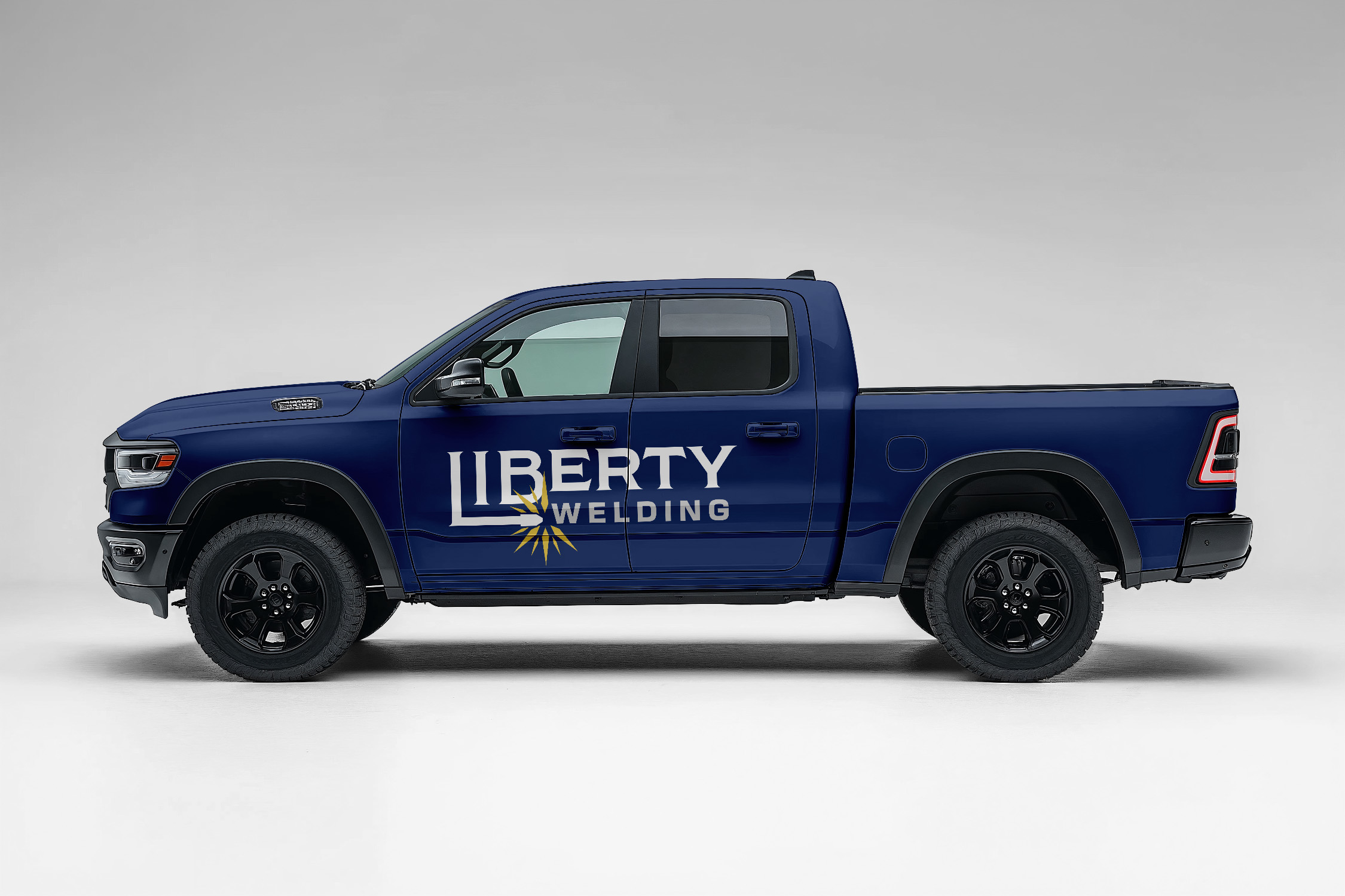
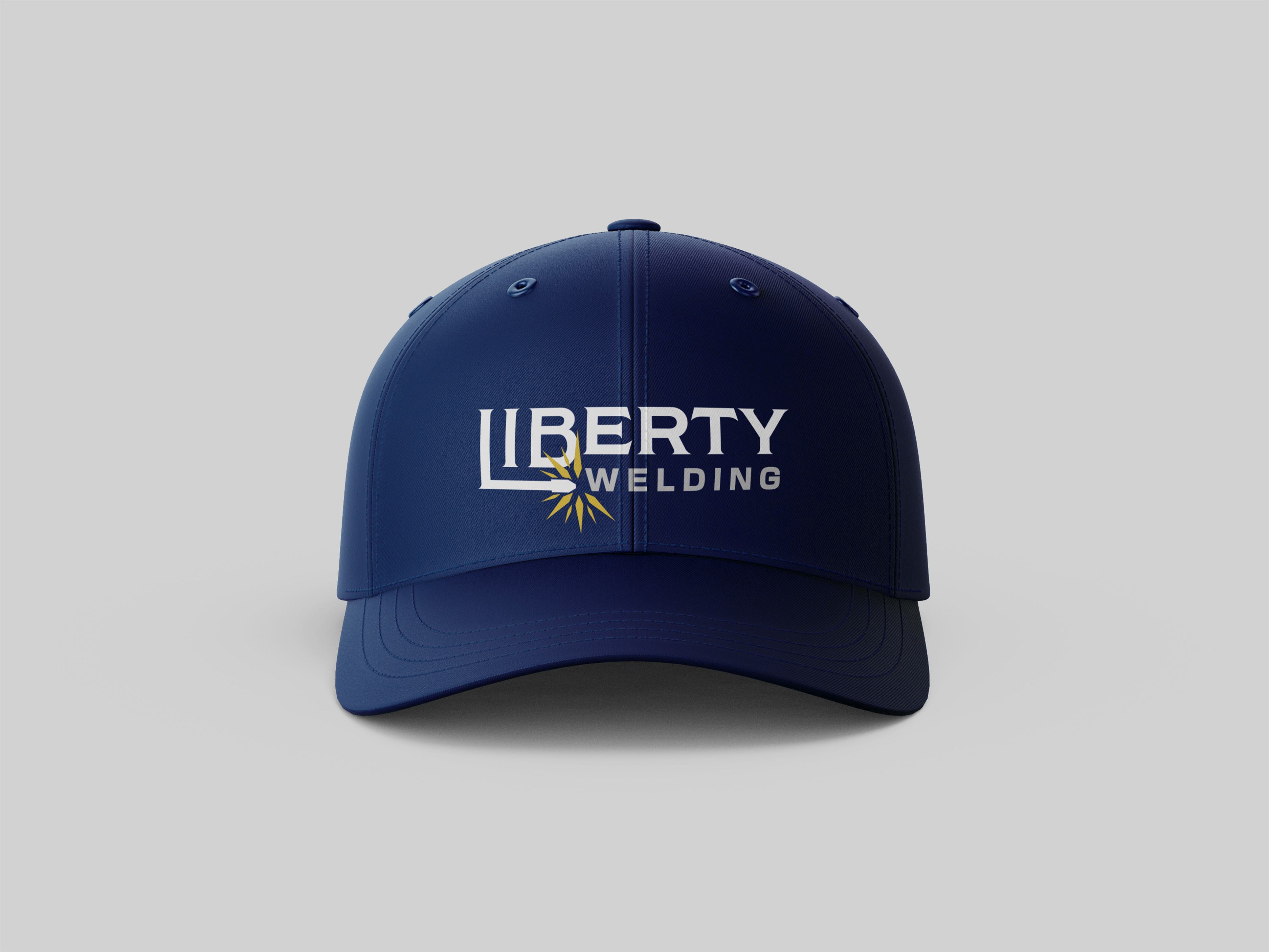
Brand collateral